
Logo Use speed run
Here's what you absolutely need to know about our brand. Take ten minutes: five to read through the five points below, and another to read them again.
1
Review our general logo rules
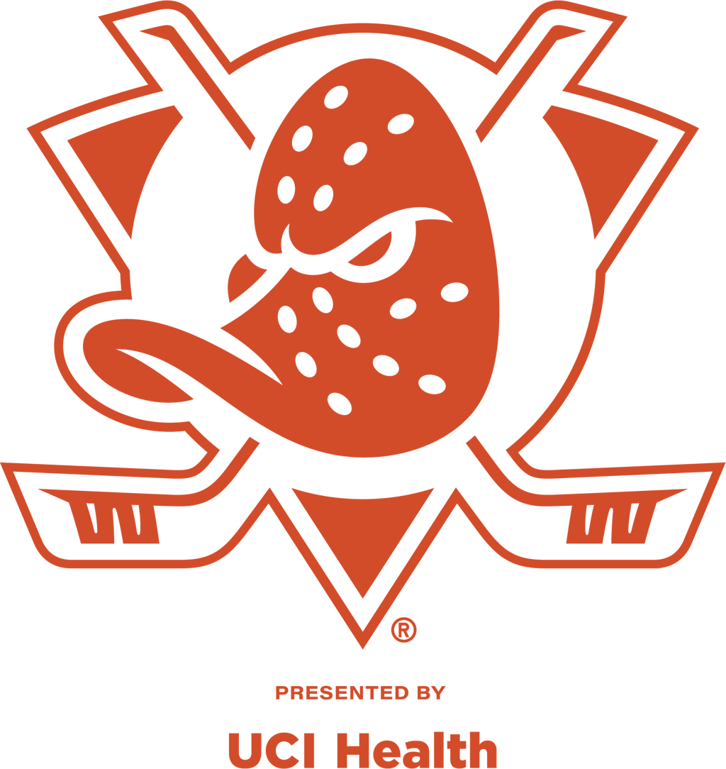
Our full-color primary mark needs a white outline when used on backgrounds with a color value of 50% or more.
Remember: If it's difficult to tell where the black puck behind Wild Wing's mask ends and the background color begins,
you're in trouble.
The registered trademark and season presenting partner mark should always be consistent with the outermost color
of the primary mark.
2
Remember our key guidelines
Our full-color crest should always be the first choice for representing our brand.
Never alter our marks. This means the logo file should always be placed unedited, unrotated, and generally
untouched—including the registered trademark symbol—on the asset being produced.
Wild Wing's mask should always be the lightest part of our mark.
Do not use our shoulder patch mark (the updated "webbed D") or our wordmark unless you've received prior
authorization to do so from Wes Tiongco, Laura Marttinen, or Nicholas Trentacost.
3
Familiarize yourself with our clear space requirements
Our logo deserves consistent room to breathe. Adequate clear space protects the integrity of our mark—and the
branding of any third parties displayed alongside it.
B
B
B
B

The minimum clear space is B, equal to the width of Wild Wing's gold eyebrow in the full-color mark. This is measured
from the outermost black line in the mark (encompassing any potential season presenting partner). In other words, the
white outline necessary for darker backgrounds counts towards the minimum clear space requirement.
4
Showcase partnerships equitably
When presented alongside a partner logo, the Ducks' mark should always be equal in visual proportion and separated
by a thin vertical keyline. Where possible, our primary mark should be on the left side of the keyline.
B
B
B
B
B
B
B
B
Partner
The widest measurement of the partner mark should never exceed the corresponding measurement of the Ducks crest.
In other words, a wide (horizontal) partner logo should not be wider than the width of the Ducks logo, and a tall
(vertical) partner logo, like the example below, should not be taller than the height of the Ducks logo.
B
B
B
B
B
B
B
B
Partner
5
Seek approval
When in doubt, reach out. The Brand Marketing and Creative teams are always happy to answer questions and provide clarification on usage and rights questions concerning our marks.
Any use of our team logos requires approval by our internal Brand and Creative teams, and in some cases, the National
Hockey League.
Internal teams should route all creative requests through our Creative Request Form.
Official partners and other external stakeholders must seek approval by contacting their Account Service
Representative, Service Team, or other Anaheim Ducks Hockey Club contact.